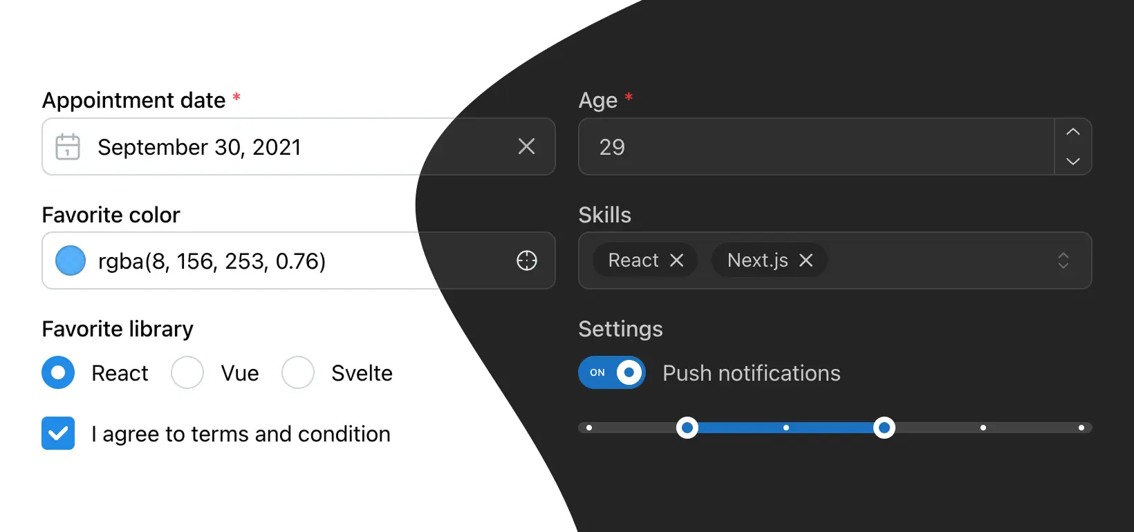
Build fully functional accessible web applications faster than ever – Mantine includes more than 100 customizable components and 50 hooks to cover you in any situation

Free and open source

All packages have MIT license, you can use Mantine in any project

TypeScript based

Build type safe applications, all components and hooks export types

Use anywhere

Mantine supports all modern frameworks: Next.js, Remix, etc.

100+ components

Every input can have description...

...and error

Dark color scheme

Dark and light theme

Add dark theme to your application with just a few lines of code – Mantine exports global styles both for light and dark theme, all components support dark theme out of the box.

import { MantineProvider } from '@mantine/core';

function Demo() {
  return (
    <MantineProvider defaultColorScheme="dark">
      <App />
    </MantineProvider>
  );
}

Customize components

Every Mantine component supports visual customizations with props – you can quickly prototype and experiment by modifying component props:

New branch

You've created new branch fix-notifications from master

2 hours ago

Commits

You've pushed 23 commits to fix-notifications branch

52 minutes ago

Pull request

You've submitted a pull request Fix incorrect notification message (#187)

34 minutes ago

Code review

Robert Gluesticker left a code review on your pull request

12 minutes ago

Color
Radius
Active
Line width
Bullet size
Align
import { Timeline } from '@mantine/core';

function Demo() {
  return (
    <Timeline active={1} bulletSize={25}>
      {/* items */}
    </Timeline>
  );
}

Styles overriding

Each Mantine component supports styles overriding for every internal element inside with classes or inline styles. This feature alongside other customization options allows you to implement any visual modifications to components and adapt them to fit almost any design requirements.

Default slider styles

20%
50%
80%
import { Slider } from '@mantine/core';

const marks = [
  { value: 20, label: '20%' },
  { value: 50, label: '50%' },
  { value: 80, label: '80%' },
];

function Demo() {
  return <Slider defaultValue={40} marks={marks} />;
}

Find elements that you need to change in styles API table

NameDescription
rootRoot element
labelThumb label
thumbThumb element
trackContainerWraps track element
trackSlider track
barTrack filled part
markWrapperContains `mark` and `markLabel` elements
markMark displayed on track
markLabelLabel of the associated mark, displayed below track

Then apply styles and add other props:

20%
50%
80%
.track {
  &::before {
    background-color: light-dark(var(--mantine-color-blue-1), var(--mantine-color-dark-3));
  }
}

.mark {
  width: rem(6px);
  height: rem(6px);
  border-radius: rem(6px);
  transform: translateX(rem(-3px)) translateY(rem(-2px));
  border-color: light-dark(var(--mantine-color-blue-1), var(--mantine-color-dark-3));

  &[data-filled] {
    border-color: var(--mantine-color-blue-6);
  }
}

.markLabel {
  font-size: var(--mantine-font-size-xs);
  margin-bottom: rem(5px);
  margin-top: 0;
}

.thumb {
  height: rem(16px);
  width: rem(16px);
  background-color: var(--mantine-color-white);
  border-width: rem(1px);
  box-shadow: var(--mantine-shadow-sm);
}
View more examples

Flexible theming

Extend default theme with any amount of additional colors, replace shadows, radius, spacing, fonts and many other properties to match your design requirements.

Bright pink badge
import { Badge, Button, MantineProvider, createTheme } from '@mantine/core';

const theme = createTheme({
  fontFamily: 'Greycliff CF, sans-serif',
  colors: {
    'ocean-blue': ['#7AD1DD', '#5FCCDB', '#44CADC', '#2AC9DE', '#1AC2D9', '#11B7CD', '#09ADC3', '#0E99AC', '#128797', '#147885'],
    'bright-pink': ['#F0BBDD', '#ED9BCF', '#EC7CC3', '#ED5DB8', '#F13EAF', '#F71FA7', '#FF00A1', '#E00890', '#C50E82', '#AD1374'],
  },
});

function Demo() {
  return (
    <MantineProvider theme={theme}>
      <Button color="ocean-blue">Ocean blue button</Button>
      <Badge color="bright-pink" variant="filled">Bright pink badge</Badge>
    </MantineProvider>
  );
}

Hooks library

Resize textarea by dragging its right bottom corner

Width: 0, height: 0

import { useElementSize } from '@mantine/hooks';
import { rem } from '@mantine/core';

function Demo() {
  const { ref, width, height } = useElementSize();

  return (
    <>
      <textarea ref={ref} style={{ width: rem(400), height: rem(120) }} />
      <div>Width: {width}, height: {height}</div>
    </>
  );
}

Ready to get started?

Mantine works in all modern environments – get started instantly with Next.js, Gatsby.js, Redwood, Vite or Remix by following getting started guide: