Build fully functional accessible web applications faster than ever – Mantine includes more than 100 customizable components and 50 hooks to cover you in any situation
Free and open source
All packages have MIT license, you can use Mantine in any project
TypeScript based
Build type safe applications, all components and hooks export types
Use anywhere
Mantine supports all modern frameworks: Next.js, Remix, etc.
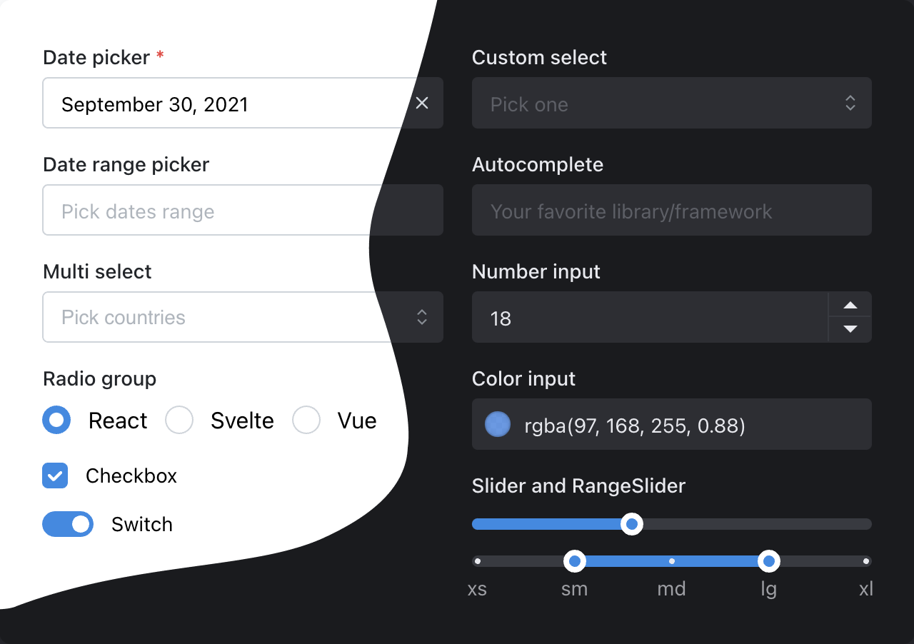
100+ components
Every input can have description...
...and error
Dark color scheme
Add dark theme to your application with just a few lines of code – Mantine exports global styles both for light and dark theme, all components support dark theme out of the box.
Customize components
Every Mantine component supports visual customizations with props – you can quickly prototype and experiment by modifying component props:
You've created new branch fix-notifications from master
2 hours ago
You've pushed 23 commits to fix-notifications branch
52 minutes ago
You've submitted a pull request Fix incorrect notification message (#187)
34 minutes ago
Robert Gluesticker left a code review on your pull request
12 minutes ago
Styles overriding
Each Mantine component supports styles overriding for every internal element inside with classes or inline styles. This feature alongside other customization options allows you to implement any visual modifications to components and adapt them to fit almost any design requirements.
Default slider styles
Find elements that you need to change in styles API table
| Name | Description |
|---|---|
| root | Root element |
| label | Thumb label |
| thumb | Thumb element |
| trackContainer | Wraps track element |
| track | Slider track |
| bar | Track filled part |
| markWrapper | Contains `mark` and `markLabel` elements |
| mark | Mark displayed on track |
| markLabel | Label of the associated mark, displayed below track |
Flexible theming
Extend default theme with any amount of additional colors, replace shadows, radius, spacing, fonts and many other properties to match your design requirements.
Build even faster with Mantine UI
120+ responsive components
built with Mantine
Build your next website even faster with premade responsive components designed and built by Mantine maintainers and community. All components are free forever for everyone.
Hooks library
Resize textarea by dragging its right bottom corner
Width: 0, height: 0
What people say
You nailed it!
Man, I've been doing Front-End for 20 years. This is, hands-down, the best component library I've ever used. What's more, the parts that I didn't like (Styling from JS Objects, slow with big forms) have been addressed in v7. Please keep it up, this library deserves more exposure, it just works and works well and beautifully. Many thanks to @rtivital and the contributors!
One of the best UI libraries I've come across.
I am a senior Frontend Developer and wanted to use something new instead of Material UI and came across this, it has been well thought of all the different scenarios you and come across, and the hooks are just pure love :)
Thank you so much for this.
Absurdly good
Hope this kind of post is ok - just wanted to say thank you.
I've been writing software professionally for 25 years, with the last 15 in web (mostly internal projects in my company). This is easily the best component library I've ever used.
In every other instance I've run into the boundaries of what the library does and have to spend a lot of time and energy customizing or extending it. Not only does Mantine provide easy access to everything under the hood, but 99% the things you need are provided as default options. I've started to lose count of the "guess I'd better build my standard xyz... oh wait, they have that too" moments. Also the docs are perfect.
Bravo, thank you.
Thank you mantine 💘
Dear Mantine Team, thank you for putting this library together. I have started to use and love Mantine in my free time, and bringing this great library to good use in our company now. All the developers are very pleased with the development experience, the time savings for any bigger project is insane. The amount of flexibility we have with our designers and developers will result in great products. All thanks to every contributor. Continue the good work!
A solution for every problem
Mantine has a solution for every problem I’ve needed to solve in my web app. Components and props are named clearly, design choices promote simplicity, and it looks beautiful out of the box. Thank you for jump starting my application in a big way!
Thank you Mantine!
Out of all react component libraries that I have ever seen this one is the most straight forward, easy to use, well documented and really beautiful. I plan on switching and using this full time. Just wanted to say huge thanks to the people that made this.
Mantine >>>
I started using Mantine for a personal project and it covers so many cases!! Enjoying every part of it so far and can't wait to get more in-depth with it.
Insane documentation
I just have to say that the level of documentation, examples, and pure utility this provides is insane. Thanks to all the contributors.
Ready to get started?
Mantine can be used both for SPA and SSR applications. Follow one of the getting started guides to build an application with Mantine using Vite, Next.js, Remix, RedwoodJS or Gatsby: